4 Tips To Help You Create a Visually Appealing Blog
Should you use a professional (or at least professional-looking) website or blog design?
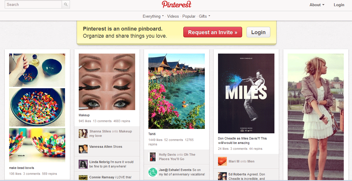
More than ever, visual design is more important than ever on the internet. Think of sites like Pinterest and Facebook, where images are shared more often than text.
That’s why it’s important to have a good blog design that includes images and a good layout to quickly capture your audience’s attention.
A professional website design makes a great first impression to your visitor. Your website represents who you are and what you’re offering. They want to know:
Is your site credible and trustworthy?
Does it look like a professional designed it (even if they didn’t)?
Is it easy to navigate?
Does your site make them feel welcome and know they are in the right place?
When designing your website ask yourself these questions. Design might not be the most important factor but it does play an important part of the first impression a visitor gets.
Four Tips for creating a great website design:
Using colors correctly. You need to use the right colors for your audience. You want to draw attention to certain elements using color. Not everything should jump out at your visitor. Also you should avoid using lot of different colors on your website. Instead, pick two to four colors for the main website and your marketing materials.
Avoid using animations, gadgets and other media when not necessary. Flash animations might look cool but do they really work with your brand? Avoid background music or animated backgrounds as well. Media and animations should support your content.
The layout. The layout should have clear navigation. The page elements should be organized instead of randomly placed all over your site. Use lots of white space by avoiding clutter. It’s hard to read a page that is crammed with elements, widgets, ads, images and text. Your eyes don’t know where to land. If your site is too busy, your visitor will most likely click away.
Fonts. Your typography needs to be legible. Carefully select font styles, font colors and font sizes that are easy for anyone to read. Most people scan pages. Using bullet lists, section headers and short paragraphs make scanning easier. Make sure your information flows well from left to right and top to bottom. Use a white or light colored background with dark colored or black text.
Your Blog design is the first impression others have of your business. Make the layout, images, fonts and colors all easy to read and free of clutter.
What tips do you have for a well designed Blog?


